March 2008 - The Housing and Mortgage Crisis in Pictures
Housing and Population Graphs
This document is subject to the Disclaimer in the Disclaimer Page linked above. Please read the Disclaimer in it's entirety.
Today (1/17/2016), I finally found a copy of a Housing and Poplulation Analysis spreadsheet I did in 2008. I used to mail this out to clients when having discussions on the phone, or present it at client meetings.
I do not recall the data sources anymore, but I believe them to be the Mortgage Bankers Association (MBA), the HUD, and the US Census Bureau.
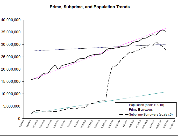
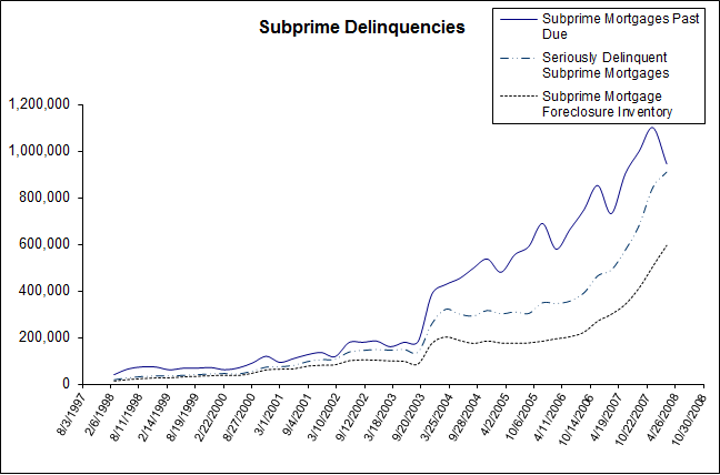
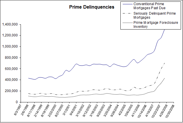
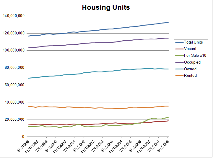
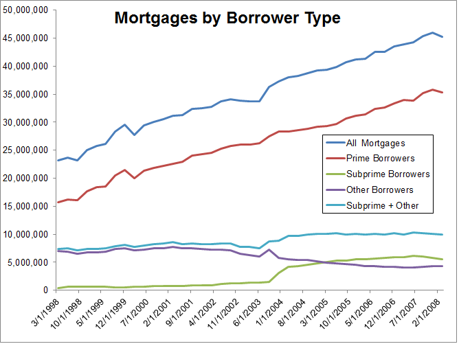
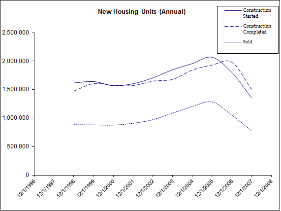
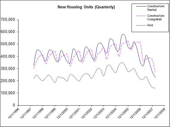
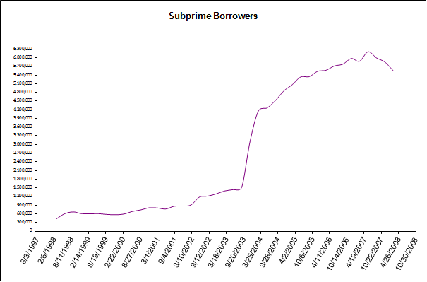
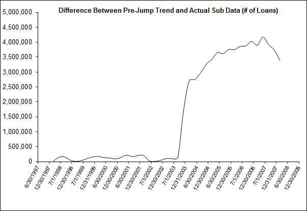
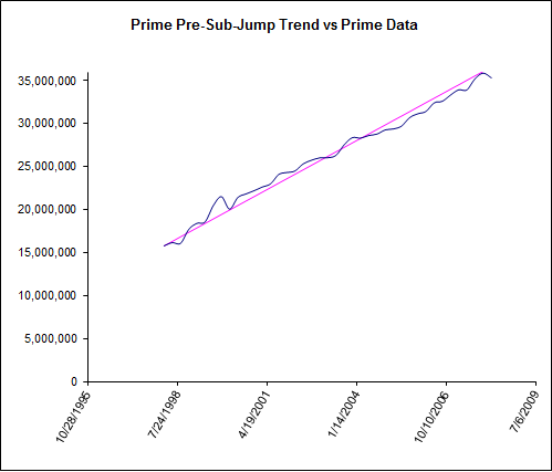
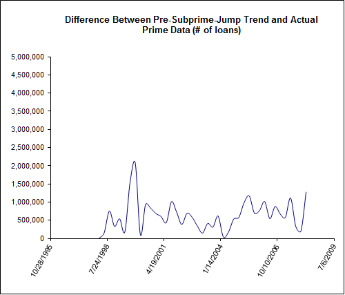
The following charts show the relationship between housing, mortgages, and the US population.
Based on this data, I concluded that the US, in 2008, had approximately 5mm excess homes that were built in response to the demand for MBS collateral due to the availability of plentiful and cheap financing. I use the 5mm estimate many times in my Crisis Notes.
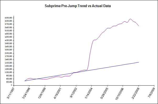
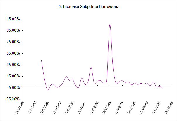
This graph tells you most of the story: starting in 2004, the number of subprime borrowers grew well above the trend line for the population, resulting in excess housing.